When it comes to building a brand, few things are as important as a logo. A logo is often the first visual representation of your brand that potential customers see. It can communicate your brand’s identity and values, and leave a lasting impression on your target audience. However, creating an effective logo isn’t always easy. In this section, we will explore logo design best practices that can help you create a logo that effectively represents your brand.
Key Takeaways
- Create a visually effective and memorable logo by following logo design best practices
- Understand your brand identity before diving into the design process
- Keep the design simple, using meaningful symbols and choosing the right color palette and typography
- Ensure scalability and adaptability, avoiding trends and prioritizing timelessness
- Gather feedback and implement your logo consistently across all platforms
Understanding Your Brand Identity
Prior to starting your logo design, it’s essential to have a clear understanding of your brand identity. Your brand identity plays a crucial role in the design process and should be aligned with your logo design. Understanding your brand identity involves identifying your brand values, target audience, and overall brand personality. Your brand values should be incorporated into your logo design through strategic use of typography, color, and symbols. Your logo design should also reflect your target audience, conveying the right message to your customers. Additionally, your logo design should embody your brand personality, reflecting your brand’s unique identity.
By aligning your logo with your brand identity, you can create a logo that resonates with your target market and effectively represents your brand. Avoid creating designs that clash with your brand identity or send mixed messages to your customers.
Once you have a clear understanding of your brand identity, you can start the actual logo design process, incorporating the key elements and principles we outlined in the previous section. Keep your brand identity in mind throughout the design process, ensuring that your logo is consistent with the overall visual identity of your brand.
Simplicity is Key
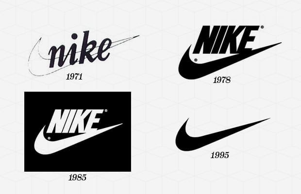
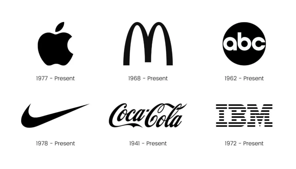
When it comes to logo design, simplicity is key. A simple and clean logo design is more memorable and easily recognizable. It’s important to avoid cluttering your logo with too many elements or complicated fonts. The simpler the logo, the more effective it is in conveying your brand’s identity.
A clean design allows for easy scalability and adaptability across various mediums and sizes. It also helps to create a timeless design that can withstand the test of time.
When considering simplicity in logo design, focus on creating a design that is sleek, minimalistic, and visually appealing. A simple logo allows customers to easily identify and remember your brand, making it more likely to stay top of mind.
Incorporating Meaningful Symbols or Icons
When designing a logo, incorporating symbols or icons can add depth and meaning to your brand. Symbols and icons provide an efficient way for brands to communicate their products or services visually. But it’s important to select symbols or icons that are meaningful and relevant to your brand. A meaningless symbol or icon can detract from the overall impact of your logo.
When choosing symbols or icons, consider the specific industry your brand is in and the message you want to convey. For example, a restaurant may use a fork and knife icon, while a fitness brand may incorporate a dumbbell icon. These symbols should be unique to your brand, as well as easy to recognize.
It’s crucial to ensure that the symbols or icons you choose integrate well with the overall design of your logo. Placing a symbol or icon that clashes with the other elements of your logo may detract from its overall impact. Balance is key when incorporating symbols or icons into your logo.
When done well, incorporating meaningful symbols or icons into your logo design can greatly enhance its visual appeal and reinforce your brand identity.
Choosing the Right Color Palette
Color is one of the most important elements of your logo. It can evoke emotions and impact the mood of your brand. When selecting a color palette for your logo, it’s important to consider your brand personality and target audience.
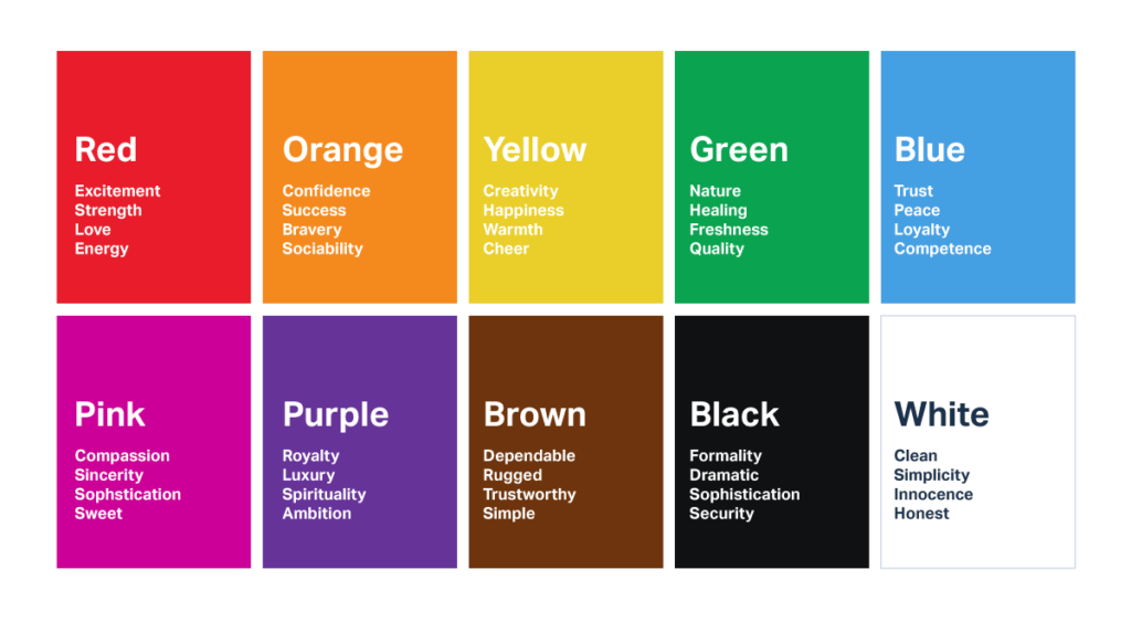
Colors can be divided into warm and cool tones. Warm colors like red, yellow, and orange can convey energy, warmth, and passion, while cool colors like blue, green, and purple can convey calmness, trust, and stability.
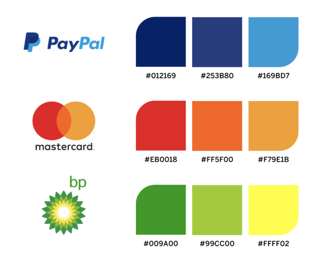
To create a harmonious color palette, choose colors that complement each other. This can be achieved by selecting colors that are opposite each other on the color wheel, or by selecting colors that are adjacent to each other.
Avoid using too many colors in your logo, as this can make it appear busy and cluttered. A general rule of thumb is to use no more than three colors in your logo design.
Remember, the colors you choose for your logo will impact the overall perception of your brand. Take the time to select a color palette that accurately represents your brand identity and resonates with your target audience.
Typography and Fonts

Typography and fonts play a crucial role in logo design. They can greatly impact the overall look and feel of your logo and convey important information about your brand. Selecting the right font for your logo is essential to ensure that it accurately represents your brand personality and message.
When considering typography and fonts for your logo, it’s important to choose fonts that are legible and easily recognizable. You don’t want your audience to struggle to read your logo or misunderstand the message it’s conveying. Consider the type of business you have and the message you want to convey through your logo.
You can also customize fonts or use unique typography to make your logo stand out and be more memorable. However, be careful not to go overboard with font choices or use too many different fonts in your logo. This can make it look cluttered and confusing.
Ultimately, the typography and fonts you choose for your logo should align with your overall brand identity and message. They should be consistent with the rest of your brand assets and create a cohesive visual identity.
Scalability and Adaptability
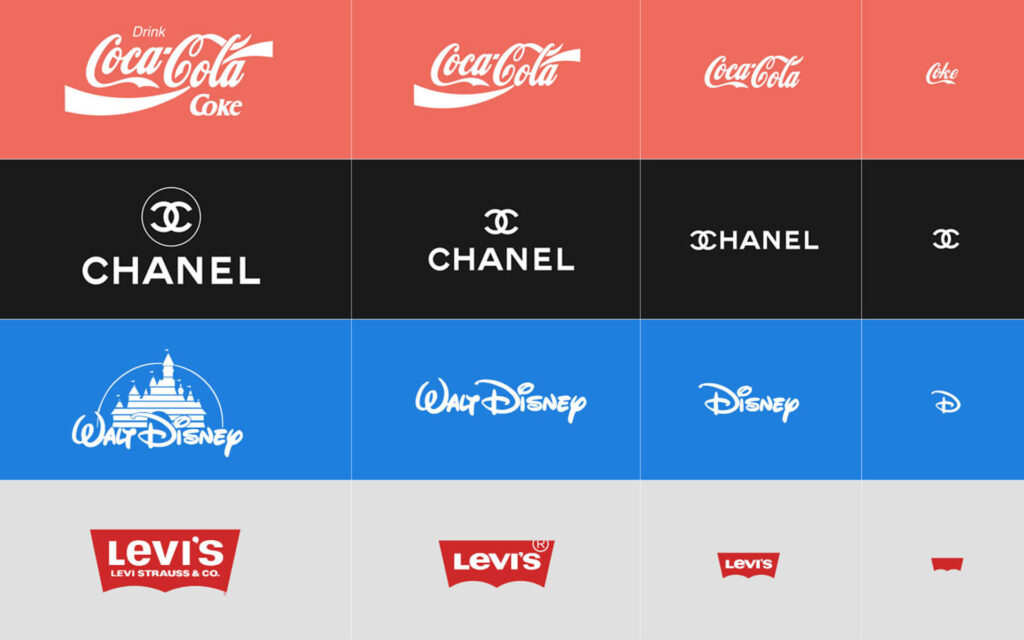
A logo is the face of your brand, and it needs to be scalable and adaptable to different mediums and sizes. A logo should be easily recognizable, whether it is displayed on a small business card or on a large billboard.
When designing a logo, ensure that it is versatile enough to be used across various platforms and applications. A logo that is not scalable or adaptable can lead to a loss of brand identity and recognition.
Pay attention to the fine details to ensure that your logo is legible and visually appealing at any size. A logo that is too complex may lose its effectiveness when scaled down, while a logo that is too simple may not be memorable when scaled up.
By prioritizing scalability and adaptability in your logo design, you can create a logo that will be effective and recognizable across all platforms and mediums.
Avoiding Trends and Timelessness
While it may be tempting to follow the latest design trends in your logo, it’s important to prioritize timelessness. Design trends come and go, but a well-designed logo should withstand the test of time.
Instead of focusing solely on current trends, consider the long-term impact of your logo design. A logo that is too trendy may quickly become outdated and lose its effectiveness.
By prioritizing timelessness in your logo design, you can create a lasting visual identity for your brand that remains relevant for years to come. So, when designing your logo, focus on creating something that is not only aesthetically appealing but also has a timeless quality that will stand the test of time.
Designing a logo that is both trendy and timeless is a delicate balance. So, it’s important to strike a balance between the two. Incorporating classic design elements with modern touches can create a logo that is trendy yet will still remain relevant in the future.
Remember, your logo is the face of your brand and communicates your identity to your target audience. By avoiding short-lived design trends and prioritizing timelessness in your logo design, you can create a visual identity that will effectively represent your brand for years to come.
Testing and Feedback
Before finalizing your logo design, it’s essential to test it with your target audience and gather feedback. This crucial step ensures that your logo communicates your brand identity effectively and resonates with your target market. Conducting surveys or focus groups can provide valuable insights into how your audience perceives your logo.
When seeking feedback, it’s important to be open-minded and receptive to constructive criticism. Consider the feedback you receive and use it to refine your logo design further. Pay attention to the elements that resonate with your audience and incorporate them into the final design.
Testing and gathering feedback should be an iterative process to ensure that your logo design aligns with your brand identity and your audience’s perceptions. By incorporating feedback into the design process, you can create a logo design that effectively communicates your brand’s values and identity.
Implementing Your Logo
Now that you have finalized your logo design, it’s time to implement it across your brand assets. Consistency is key in ensuring brand recognition and recall.
Start by using your logo on your website, social media platforms, business cards, and other marketing materials. Make sure to use the correct file format and version of your logo for each platform.
Consider creating brand guidelines that define the correct usage of your logo, including the minimum size, color options, and placement. This will help maintain a cohesive visual identity and prevent any misuse of your logo.
You can also consider creating branded merchandise such as t-shirts, mugs, or pens featuring your logo. This can help increase brand awareness and loyalty.
Logo Usage Examples
| Platform | Example |
|---|---|
| Website |  |
| Social Media | 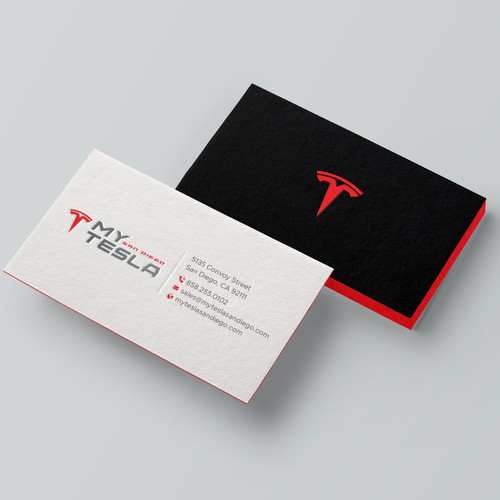 |
| Business Card |  |
By following these logo design implementation tips, you can ensure that your logo effectively communicates your brand identity and builds recognition in the minds of your target audience.
Conclusion
Logo design is a crucial component of building brand identity. By following these logo design best practices, you can create a logo that effectively communicates your brand’s personality and values while being easily recognizable and memorable. It’s important to start with a clear understanding of your brand identity and align your logo design accordingly. Keep the design simple, yet meaningful, by using symbols or icons that represent your brand and choosing a color palette and typography that evoke the desired emotions. Ensure your logo is scalable and adaptable to different mediums and sizes.
It’s also crucial to prioritize timelessness over trends and gather feedback from your target market before finalizing your logo design. Once your logo is finalized, implement it consistently across all platforms and materials to maintain a cohesive visual identity. By incorporating these best practices into logo design, you can create a logo that stands the test of time and effectively represents your brand.
FAQ
Q: What are logo design best practices?
A: Logo design best practices are guidelines and principles that help create visually effective and memorable logos. They involve understanding your brand identity, simplicity, incorporating meaningful symbols or icons, choosing the right color palette, typography and fonts, scalability and adaptability, avoiding trends and focusing on timelessness, testing and gathering feedback, and implementing your logo consistently.
Q: Why is understanding brand identity important in logo design?
A: Understanding your brand identity is crucial in logo design as it helps align your logo with your brand values, target audience, and overall brand personality. By creating a logo that resonates with your target market and effectively represents your brand, you can establish a strong brand identity and differentiate yourself from competitors.
Q: Why is simplicity important in logo design?
A: Simplicity is key in logo design because a simple and clean design is more memorable and easily recognizable. By avoiding clutter and focusing on sleek and minimalistic designs, you can create logos that leave a lasting impact and maintain visual appeal across various mediums and sizes.
Q: How can meaningful symbols or icons enhance a logo?
A: Meaningful symbols or icons can add depth and significance to a logo by conveying the essence of your brand or industry. By carefully choosing symbols or icons that are relevant to your products/services, you can create logos that communicate your brand’s identity and values in a visually appealing way.
Q: What should I consider when choosing a color palette for my logo?
A: When choosing a color palette for your logo, consider your brand personality and the emotions you want to evoke. Different colors have different meanings and associations, so select colors that align with your brand and resonate with your target audience. Understand the psychology of colors and their impact on consumer perception.
Q: How does typography and fonts influence a logo design?
A: Typography and fonts greatly impact the overall look and feel of a logo. Choose fonts that are legible and appropriate for your brand, taking into account your business type and the message you want to convey. Customized fonts or unique typography can also help your logo stand out and reinforce your brand identity.
Q: Why is scalability and adaptability important in a logo design?
A: A logo should be scalable and adaptable to different mediums and sizes without losing its visual appeal and legibility. It should look equally good on a small business card or a large billboard. Pay attention to the fine details and ensure your logo remains versatile across various platforms and applications.
Q: Why should I focus on timelessness instead of following design trends?
A: Design trends come and go, but a well-designed logo should withstand the test of time. Prioritize timelessness over trends to ensure your logo remains relevant and recognizable for years to come. A timeless logo helps establish brand consistency and builds trust with your audience.
Q: How can I gather feedback and test my logo design?
A: Before finalizing your logo design, conduct surveys or focus groups to gather feedback from your target audience. This feedback can provide valuable insights into the effectiveness and appeal of your logo. Incorporate constructive feedback into the design process to refine and improve your logo before implementation.
Q: What should I consider when implementing my logo across various platforms?
A: When implementing your logo, ensure consistency in its usage across your website, social media platforms, business cards, and other marketing materials. Consider creating brand guidelines that outline the proper usage of your logo to maintain a cohesive visual identity and strengthen brand recognition.

