3 Questions to Ask Yourself Before Choosing a Logo Color
Before you even start designing your logo, you need to think about the colors you’ll be using. While the design process isn’t always this cut and dry, you need to have a firm grasp of the different factors that go into choosing a logo color before you dive into the design process.
If you’re new to the design world, you might not yet realize that every color has a meaning. The right shade of green might mean something completely different depending on the company as well as the logo. Read on to learn more about why you need to take a step back and think about a logo before you even start designing.
![]()
1) Why Does the Logo Color Matter?
Color is one of the most important parts of a logo. It can influence how people perceive your logo and can help your brand stand out from the rest. Choosing the right color for your logo will help create a better marketing strategy for your company and make the logo both memorable and likable to your target audience.
Additionally, you will want to choose the right color for the context of your brand. For example, if your main product is green, then your logo will need to have a green color to accurately represent your logo.
Define your Brand and Understand Your Audience
Before you choose a certain color, you need to have a better understanding of what your brand is and who your target audience is. Start by defining your brand and writing down any details you already know.
Next, you need to think about what your brand is and what it stands for. This will help you narrow down your logo options and understand what makes your brand unique.
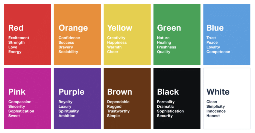
Below is a guide on how people emotionally relate to colors within a logo.
2)What’s the Best Primary Color Your Logo?
When you choose a primary color for your logo design, make sure that it complements your brand’s color scheme. A primary logo color should always be used for simple logo designs. For example, if your logo is blue, then its best to choose a blue as your primary logo color. This will make the logo easy to read and allow it to stand out from the crowd.
3) What Secondary Color complements your Primary Color?
A secondary logo color works best for making a statement and adding contrast to a logo design. Choosing a secondary color is optional and can be used to help differentiate your logo and add a bit of flare to an otherwise simple design.
For example, if you choose a red or orange secondary logo color, it will help set your logo apart and make it stand out in the crowd. While a secondary logo color can be used to make a statement, you need to be careful not to mix too many different shades of the same color to make the logo too busy.
Final Thoughts
No matter what type of logo design you choose, you will want to make sure that the color is right. This is because it will help your logo stand out, make it memorable, and it will also help you gain a better marketing strategy for your company. Choosing the right logo color can be tricky and can take a bit of trial and error, but it is well worth the effort.
When it comes to choosing a logo color, you will want to make sure that it is the right color for your brand and that it fits in with the rest of your marketing strategy. If you choose the wrong color, it could damage your brand and make it look unprofessional.