
Creating a logo that sets your brand apart from the competition, resonates with your target audience, and communicates your brand identity effectively can be a challenging task. There are several essential tips to keep in mind when designing a logo that captures the essence of your brand and makes a lasting impression.
Key Takeaways:
- Develop a clear understanding of your brand identity and values to create a logo that effectively represents your brand.
- Research your competitors’ logos to gain inspiration and ensure your logo stands out in the market.
- Keep your logo design simple, memorable, and versatile to make it appealing to your audience across various platforms.
- Choose the right colors and typography to convey your brand message and evoke the desired emotions in your audience.
- Iterate and refine your logo design based on feedback from your target audience, colleagues, and design professionals.
Understand Your Brand Identity
Before you start designing your logo, it’s important to have a clear understanding of your brand’s identity. Your logo should be a visual representation of your brand’s values, personality, and unique selling proposition. Think about what makes your brand stand out from the competition and how you want your audience to perceive your brand.
To create a logo that effectively communicates your brand’s identity, ask yourself the following questions:
1) What is the purpose of my brand?
2) What are my brand values?
3) Who is my target audience?
4) What are my competitors doing?
5) How do I want my audience to feel when interacting with my brand?
By answering these questions, you’ll be able to create a logo that resonates with your target audience and clearly communicates your brand’s identity. Plus, understanding your brand’s identity will help you make informed design decisions throughout the logo-making process.
Research Your Competitors
Researching your competitors’ logos is an essential step in creating a logo that stands out from the crowd. By analyzing the design elements, color palettes, and overall aesthetic of your competitors’ logos, you can gain valuable insights and inspiration for your own logo.
However, it’s essential to avoid copying or imitating your competitors’ logos. Instead, use their designs as a benchmark for creating a logo that is unique and memorable.
Avoiding Logo Similarity
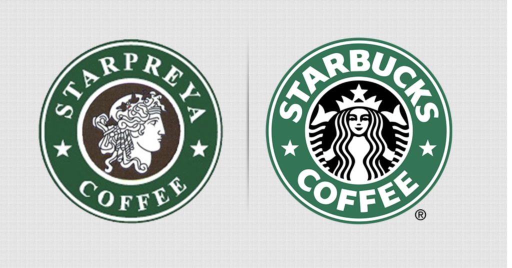
One way to ensure your logo stands out is by creating a logo that has a distinct look and feel. You can achieve this by identifying design elements that your competitors are not using or by combining different design elements in an innovative way.
Another way to avoid logo similarity to your competitor is to use different color palettes or typography. Colors and fonts play a significant role in logo design and can change the perception of the logo. Choosing a distinct color palette or font style can set your logo apart from your competition.
Utilizing Logo Inspiration
While researching your competitors’ logos, pay attention to details that you admire or that evoke certain emotions. This information can be used as inspiration for your own logo. However, it’s crucial to ensure that your logo remains original and not simply a copy of your competitors’ designs.
By using your competitors’ logos as a benchmark and source of inspiration, you can create a logo that is unique, memorable, and effectively communicates your brand’s identity to your target audience.
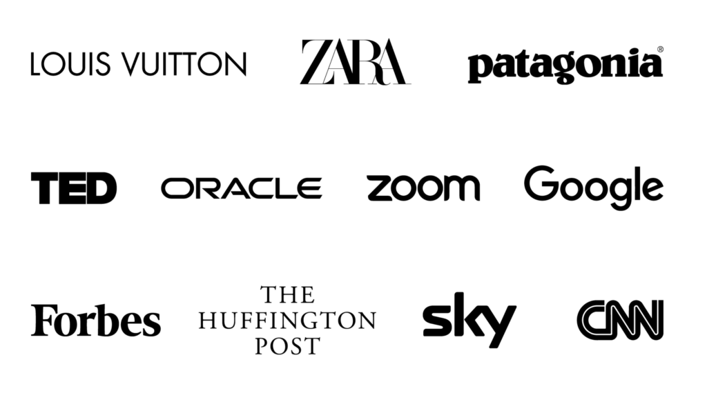
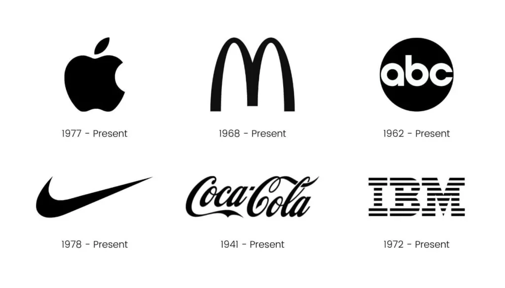
Keep It Simple and Memorable
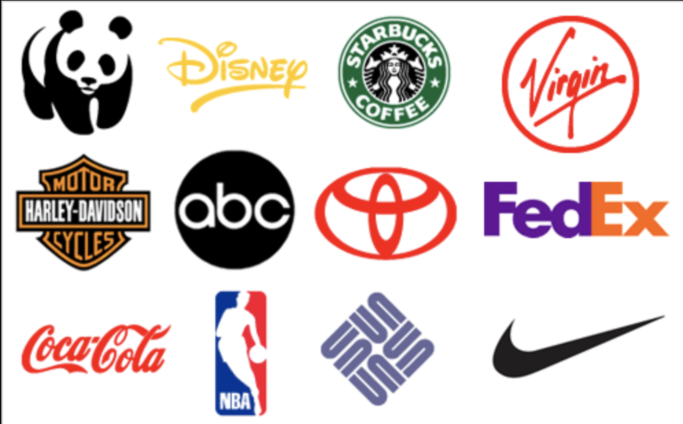
When designing a logo, it’s important to aim for simplicity. A clean and uncluttered logo will be easily recognized and remembered by your audience, making it more likely to make an impact.
Think about logos from some of the world’s most recognizable brands – Apple, Nike, and Coca-Cola, for example. They are all simple yet memorable.
By keeping your logo design simple, you can also ensure that it remains versatile. A logo with too many elements or details may not be suitable for use across different mediums and sizes, ultimately reducing its impact.
Tip: When designing your logo, consider how it will look in black and white. If it remains clear and recognizable without color, it’s a sign that you have successfully created a simple yet impactful design.
Another benefit of keeping it simple is that it can make your logo easier to reproduce, even with limited resources. This can be particularly important for small businesses or startups with limited budgets.
In summary, when it comes to logo design, less is often more. By keeping your logo simple and memorable in conjunction with the other logo making tips, you can create a design that effectively communicates your brand identity and resonates with your target audience.
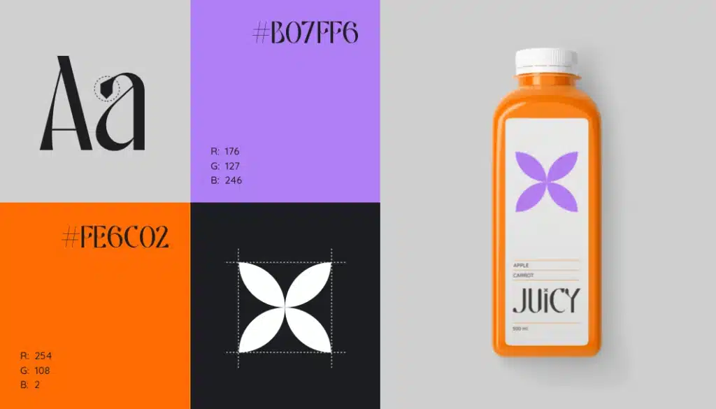
Choose the Right Colors
![]()
When it comes to logo design, color selection plays a critical role in evoking emotions and conveying meaning to your audience. Your color palette should align with your brand personality and values while eliciting the desired emotional response from your target audience. Here are some tips to consider when choosing the right colors:
- Research color psychology: Different colors are associated with specific emotions and can influence how your audience perceives your brand. Do some research on color psychology to ensure your color choices align with your brand values and message.
- Avoid using too many colors: While it may be tempting to incorporate multiple hues, using too many colors can clutter your logo and make it hard to read. Stick to a maximum of three colors to keep your logo clean and legible.
- Experiment with hues: Play around with different shades and tones of your chosen colors to find the perfect combination that best represents your brand.
Typography Matters
Typography is another key consideration when creating a logo. The right font and style can help convey your brand identity and attract your target audience.
Consider the following when choosing typography for your logo:
- Legibility: Ensure your logo is easily readable from a distance and in different formats.
- Font style: Select a font style that aligns with your brand personality. For example, a tech company might opt for a sleek and modern font, while a vintage clothing brand may choose a more ornate and decorative font.
- Font size: Make sure your font size is proportional to the rest of your logo design.
- Consistency: Use the same typography consistently across all branding materials to establish a cohesive brand identity.
By paying close attention to typography, you can enhance the impact of your logo and ensure it effectively communicates your brand message.
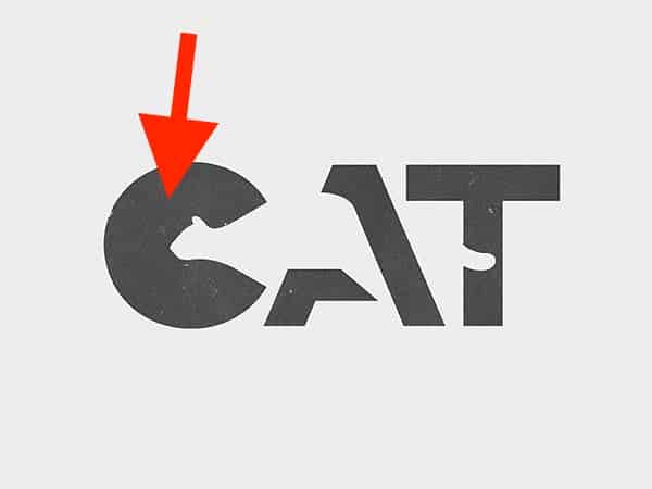
Use Negative Space Creatively
In logo design, negative space refers to the space around and between the main elements of the logo. Using negative space creatively can help you create a logo that is unique, memorable, and visually interesting.
One way to use negative space is to combine it with positive space to create a hidden image or message. For example, the FedEx logo uses negative space to create an arrow between the “E” and “X,” symbolizing movement and forward progress.
| Positive Space | Negative Space |
|---|---|
 |  |
Another way to use negative space creatively is to create a sense of depth or dimensionality. This can be achieved by layering elements on top of each other and using negative space to create a sense of separation.
When using negative space in logo design, it’s important to ensure that the negative space doesn’t overwhelm the positive space and that the logo remains clear and legible.
By using negative space creatively, you can add an extra layer of meaning and interest to your logo, making it more memorable and impactful.
Test for Scalability
After designing your logo, it’s critical to test for scalability. Your logo should be versatile enough to be used on a variety of mediums, from small business cards to large billboards. Testing for scalability ensures that your logo remains clear and legible, regardless of the size or format.
To test for scalability, try resizing your logo and printing it out at different sizes. Check if all the design elements remain visible and readable. Additionally, test for the logo’s scalability across different mediums, such as online and print.
Remember, a logo that doesn’t scale well may lose its impact and fail to communicate your brand identity effectively. By testing for scalability, you can ensure that your logo continues to speak for your brand in any context.
Seek Feedback

Seeking feedback on your logo design can be beneficial in refining it. The insights you gain from your target audience, colleagues and design professionals can help you to create a logo that truly represents your brand. To get the most reliable feedback, show your logo to a diverse group of people who can provide different perspectives.
When receiving feedback, listen carefully to the comments and don’t take them personally. Use the suggestions to refine and iterate your logo design and make it better. Remember to keep your brand identity and target audience in mind while making changes.
It’s essential to seek feedback from people who are not directly involved in the logo design process since they can provide objective perspectives. You can also utilize online tools and communities to get feedback on your logo design.
Tip: Don’t be afraid to make changes to your logo design after receiving feedback. Iterating and refining your logo can lead to a more impactful and successful brand identity.
Consider Longevity
When designing a logo, it’s essential to think about its longevity. A logo should be timeless and remain relevant for years to come, avoiding design trends that may quickly become outdated.
The logo should represent your brand’s identity, values, and unique selling proposition, but it should also be flexible enough to adapt to any changes or updates within your business. You don’t want to change your logo every few years, as this can disrupt your brand recognition and dilute brand equity.
Keeping your logo simple and memorable can contribute significantly to its longevity. A clean design with minimal elements ensures that your logo remains recognizable, even as your brand evolves and grows.
It’s also essential to consider the readability and scalability of your logo. The logo should remain clear and legible, regardless of its size or medium, from small social media profile pictures to large billboards.
To ensure that your logo stands the test of time, avoid using temporary design fads and focus on creating a logo that can adapt to changing trends and technological advancements. By doing so, you can build a brand that remains relevant and impactful for many years to come.
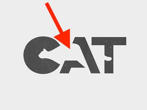
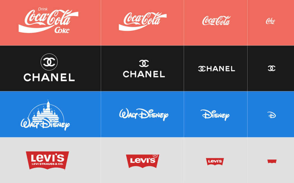
Ensure Versatility
![]()
Creating a logo that is versatile is crucial for its success. Your logo should look great and be recognizable no matter what format or medium it is displayed on. Whether it’s on your website, social media profiles, business cards, or merchandise, your logo must be visually appealing and easy to identify.
To ensure versatility, test your logo in various sizes, from small to large, to make sure it remains clear and legible. Also, consider how your logo will look in grayscale or black and white, as well as its appearance when reversed (white on black).
It’s also important to ensure your logo looks good in different orientations. Your logo should look great whether it’s horizontal, vertical, or square. A versatile logo will make it easy to use your branding across different platforms and mediums, helping to establish your brand identity and increase brand recognition.
Tips for Making a Logo
A great logo is essential for any business looking to leave a memorable impression on their audience. However, creating a logo that truly represents your brand requires careful planning and execution. Here are some essential logo making tips to help you design a logo that effectively communicates your brand’s identity.
Understand Your Brand Identity
Before you start designing your logo, it’s crucial to have a clear understanding of your brand’s identity. Your logo should reflect your brand’s values, mission, and target audience. Take the time to define your brand’s unique selling proposition, personality, and visual style to create a logo that accurately represents your brand and resonates with your audience.
Research Your Competitors
It’s always a good idea to research your competitors’ logos before designing your own. This can provide valuable insights and inspiration for your own logo design. Analyze your competitors’ design elements, color palettes, and overall aesthetic to ensure your logo stands out in the market.
Keep It Simple and Memorable
When it comes to logo design, less is often more. Aim for a clean and uncluttered design that is easy to recognize and remember. A simple yet memorable logo can leave a lasting impression on your audience.
Choose the Right Colors
Colors play a significant role in logo design as they evoke emotions and convey meanings. Select colors that align with your brand personality and evoke the desired emotions in your target audience. Consider color psychology when choosing your logo colors to create a memorable and impactful design.
Typography Matters
The right typography can enhance the impact of your logo design. Consider the font style, size, and legibility to ensure that your logo communicates your brand message effectively. Your typography should complement your logo design and convey the right tone and personality.
Use Negative Space Creatively
Negative space in logo design can be utilized to create visual interest and convey additional meaning. Explore creative ways to incorporate negative space into your logo to make it more unique and memorable. A well-designed negative space logo can leave a lasting impression on your audience.
Test for Scalability
Your logo should be versatile and scalable. Test your logo across different sizes and mediums to ensure it remains clear and legible, whether it’s displayed on a small business card or a large billboard. Your logo should look great no matter where or how it’s displayed.
Seek Feedback and Iterate
Don’t be afraid to seek feedback from your target audience, colleagues, and design professionals. Use their insights to refine and iterate your logo design until it truly captures the essence of your brand. A well-designed logo can help elevate your brand and create a memorable impression on your audience.
Consider Longevity
Your logo should stand the test of time and remain relevant for years to come. Avoid design trends that may quickly become outdated, and opt for a timeless logo that will remain impactful in the long run. A great logo should be able to stand on its own, regardless of the latest design trends.
Ensure Versatility
Your logo will be used across various platforms, from websites to social media profiles and merchandise. Ensure that your logo looks equally impressive and recognizable in different contexts and formats. A versatile logo can help increase brand recognition and leave a lasting impression on your audience.
Wrapping Up
By following these essential logo making tips, you can design a logo that accurately represents your brand and resonates with your target audience. Remember to keep it simple, memorable, and versatile, and don’t be afraid to seek feedback from others. With a great logo, you can leave a lasting impression and elevate your brand’s presence.
FAQ
Q: What are some tips for making a logo?
A: Here are some essential tips for creating impactful logos:
Q: Why is it important to understand my brand’s identity before designing a logo?
A: Understanding your brand’s identity helps ensure that your logo accurately represents your brand values, target audience, and unique selling proposition.
Q: How can researching competitors’ logos help with logo design?
A: Researching competitors’ logos provides valuable insights and inspiration, allowing you to create a logo that stands out in the market.
Q: Why is simplicity important in logo design?
A: A simple and uncluttered logo is easily recognized and remembered by your audience.
Q: How do colors impact logo design?
A: Colors evoke emotions and convey meanings. Choose colors that align with your brand personality and evoke the desired emotions in your target audience.
Q: Why does typography matter in logo design?
A: The right choice of typography enhances the impact of your logo. Consider the font style, size, and legibility to effectively communicate your brand message.
Q: How can negative space be creatively used in logo design?
A: Negative space in logo design can create visual interest and convey additional meaning. Explore creative ways to incorporate negative space into your logo for uniqueness and memorability.
Q: Why is scalability important in logo design?
A: A logo should be versatile and maintain clarity and legibility across different sizes and mediums, from small business cards to large billboards.
Q: What should I do to get feedback on my logo design?
A: Seek feedback from your target audience, colleagues, and design professionals to refine and iterate your logo design.
Q: How can I ensure that my logo remains relevant for years to come?
A: Avoid design trends and opt for a timeless logo that will stand the test of time and remain impactful in the long run.
Q: Why is versatility important when designing a logo?
A: Your logo will be used across various platforms and formats. Ensure that it looks impressive and recognizable in different contexts.
Q: What is the key to creating a memorable and effective logo?
A: Creating a memorable and effective logo requires time and careful consideration. Follow these logo making tips to capture the attention of your audience and communicate your brand’s story.